Letters Among the Marks
How does a readable sign change the way we look?
Words and signs can give the eye a readable landmark among other marks. Follow lettering within or beside figures, then compare signs that also work as graphic shapes. Framing, placement and surrounding lines can change their prominence. Look for the moment when you begin reading a mark, and when you return to following its outline.
The Word Inside the Body
Three works carry explicit text absorbed into or standing apart from a figure, treating language as a material element rather than a caption or title.
NNOTB #90
nnxyz
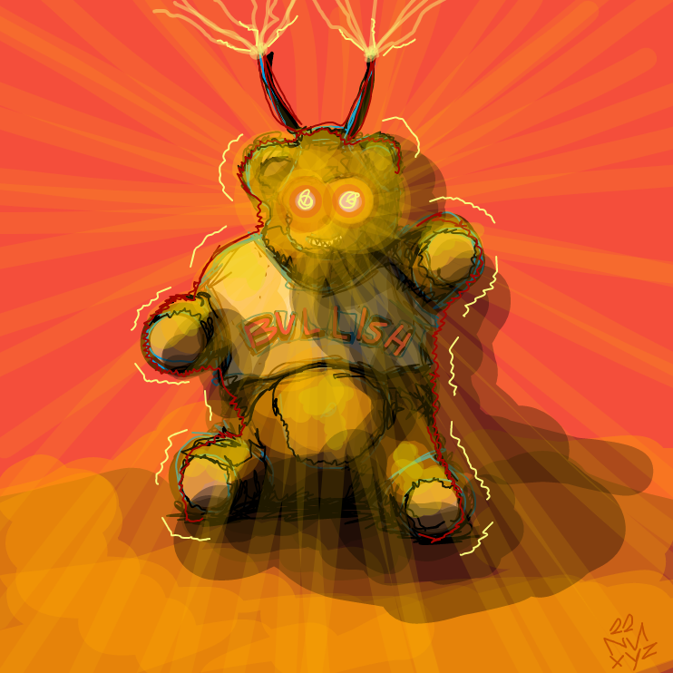
View & watch drawing'BULLISH' floats in semi-transparent red lettering across the bear figure's torso, absorbed into the body rather than sitting cleanly on top of it.
NNOTB #100
nnxyz
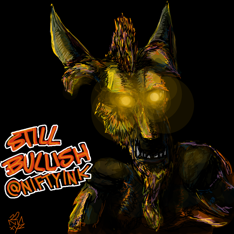
View & watch drawing'STILL BULLISH @NIFTYINK' appears in solid outlined letters separate from the loose mark-making of the dark horned figure — declaration standing apart from dissolution.
NNOTB #87
nnxyz
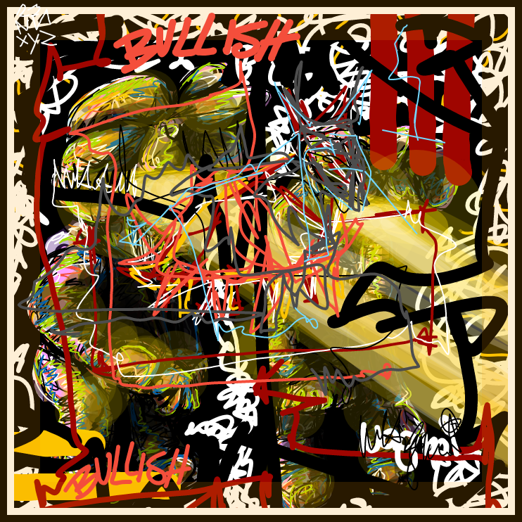
View & watch drawingTwo red 'BULLISH' blocks sit at the upper-left and lower-left, holding a dense interior of colliding marks and looping lines between them like brackets around noise.
Both works carry the same word, but here it shifts from transparent overlay into hard-edged block text that stands apart from the figure it accompanies.
The single word now doubles, anchoring two corners of the left field rather than inhabiting a figure — text functioning as structural device rather than label.
Signs That Behave as Shapes
Three works carry marks that resemble writing or symbols but resist full decoding, functioning as visual weight and rhythm rather than readable content.
NNOTB #281
nnxyz
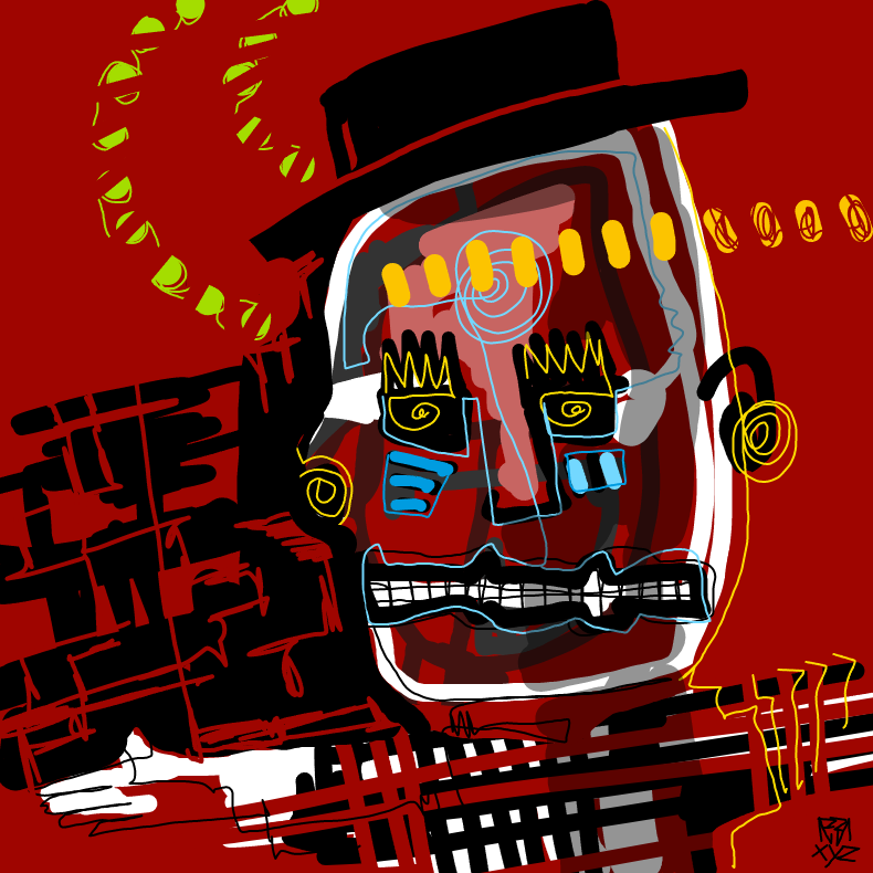
View & watch drawingCrown shapes with spirals, blue blocks, and a lime-green oval chain compete as visual events; no single mark resolves into plain meaning.
The explicit word disappears; what remains are symbol-like forms — crowns, spirals, grids — that carry the look of significance without delivering a readable message.
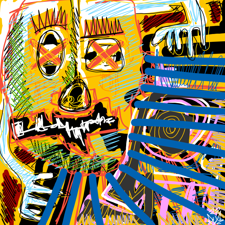
NNOTB #116
nnxyz
View & watch drawingWhite hand-lettered marks run across the mid-section but remain illegible as text, functioning instead as horizontal rhythm against the cross-hatched lower quadrant.
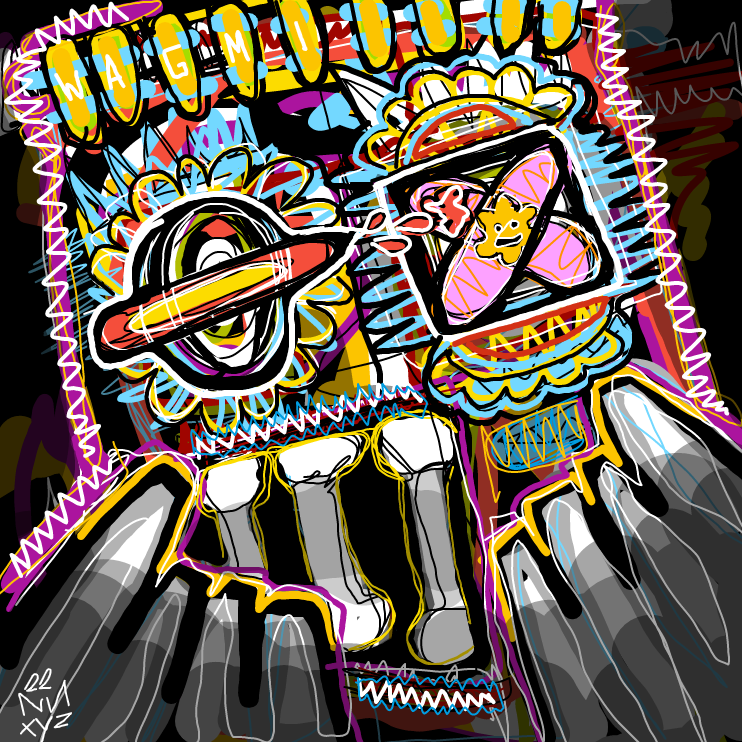
NNOTB #108
nnxyz
View & watch drawingLoose lettering fills the top band in the same thick outline style as the central forms, making text and image indistinguishable in visual weight.
Both works layer mark types across a busy field, but here a face structure organizes the surface — X-marked oval eyes and an open round mouth hold the center while marks compete around them.
The face structure becomes more schematic — two eye-like forms, one a tight spiral and one a cross-hatched rectangle, sit side by side, and the lettering above reads as part of the same drawn system.
Faces Without Anchors
Four works build faces from glowing voids, scribbled masses, and competing color zones — present as figures but without the stability a readable sign might provide.
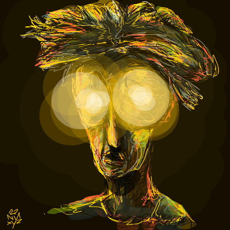
NNOTB #86
nnxyz
View & watch drawingTwo blown-out light orbs replace eyes entirely, erasing the detail that would anchor expression; the face is present but not fully legible.
After works dense with competing marks, this face strips back to near-darkness — a scribbled mass above and looping jaw below hold a figure together without resolving it.
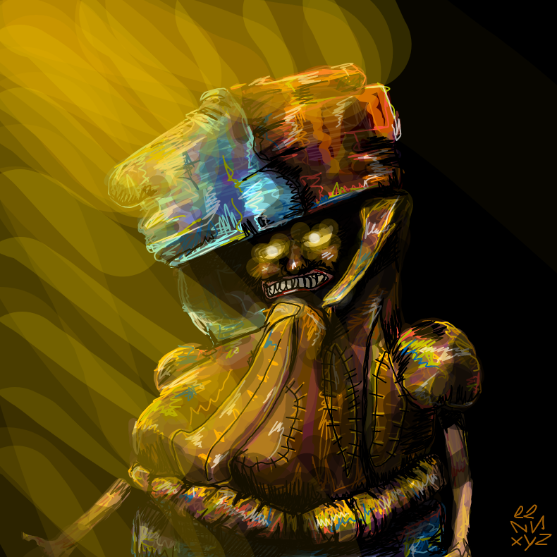
NNOTB #85
nnxyz
View & watch drawingStitched seam lines and bared teeth give the figure visible structure, but the fractured hat and uneven background glow keep it from settling into a stable read.
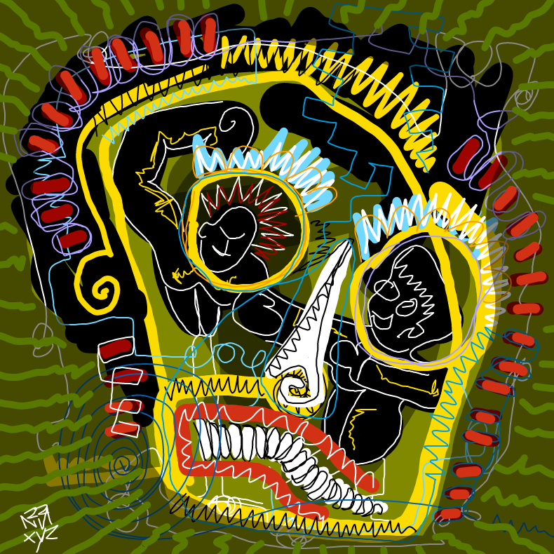
NNOTB #188
nnxyz
View & watch drawingCoiled white rows, red spikes, and a hard white wedge fill the rounded form's interior, holding the image between a face and something else entirely.
Where the previous face dissolved into light and dark, this one is assembled — seams, teeth, and a layered hat — yet the parts refuse to cohere into a single mood.
The stitched assembly gives way to a form whose interior splits into competing zones — the coiled lower section reads as teeth or grin, but no dark opening confirms it.
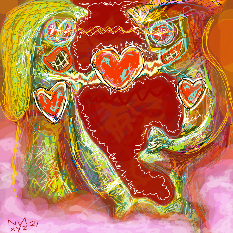
NNOTB #5
nnxyz
View & watch drawingHeart shapes appear as both central form and repeated smaller motifs; the jagged white outline keeps the familiar symbol unsettled rather than resolved.
The face structure drops away; a recognizable symbol takes its place, but the jagged outline and warm dense field give it the same unresolved quality as the faces before it.
Text as Costume and Label
Two works place legible text on or near figures as a worn or projected identity, where the word becomes a prop or badge rather than a description.
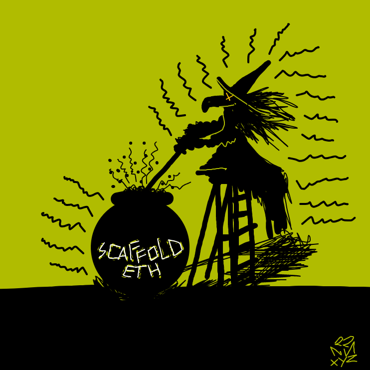
NNOTB #96
nnxyz
View & watch drawing'SCAFFOLD ETH' hand-lettered on the cauldron pulls the silhouetted figure between emblem and joke, ceremony and deflation held in the same image.
The heart symbol gives way to a fully legible label — but the text is on an object the figure bends over, making the word a prop rather than a body marking.
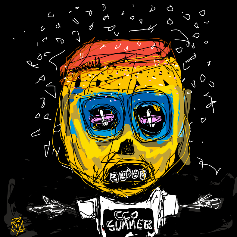
NNOTB #214
nnxyz
View & watch drawing'CCO SUMMER' on a white collar label below the face reads as a tag worn by the yellow figure, while scattered white mark fragments around the black field read as static.
The text moves from object to body — worn as a collar label rather than inscribed on a cauldron — and the figure's blue-framed goggle eyes give it a fixed outward stare the silhouette lacked.
Everything at Once
Two works push marks, motifs, text, and assembled parts to every edge simultaneously, testing how much a single surface holds before any hierarchy collapses.
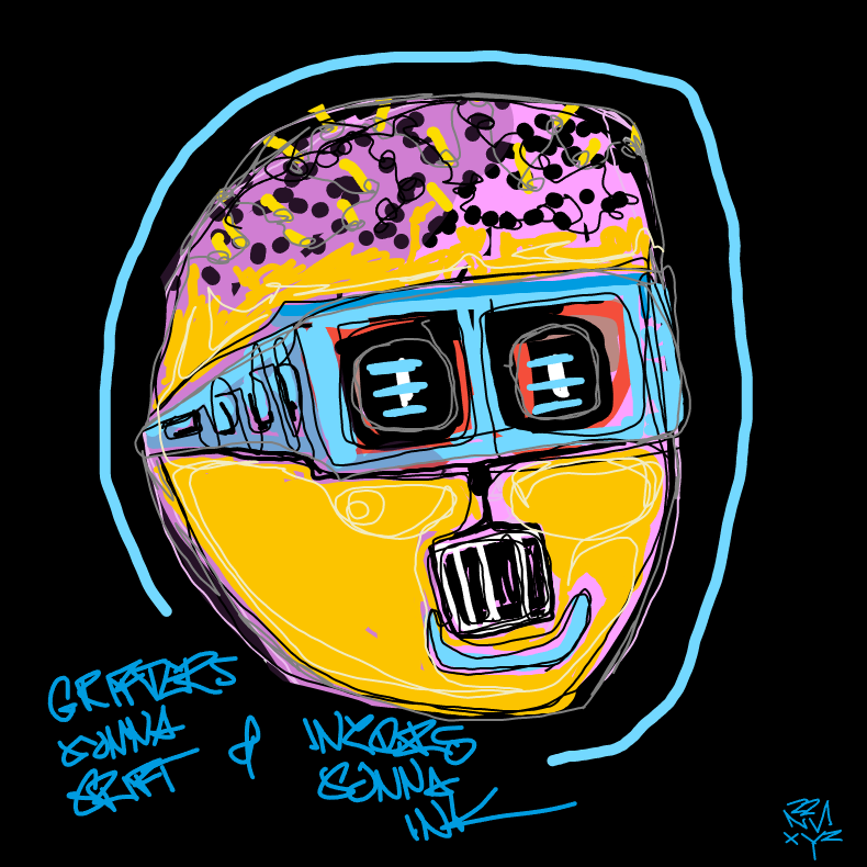
NNOTB #298
nnxyz
View & watch drawingGraffiti lettering in the lower-left corner sits beside a mechanical face with lens-bar eyes and a barred mouth unit, treating text as a second layer of address alongside the figure.
The collar badge becomes graffiti — text that addresses the viewer from outside the figure rather than being worn by it, while the face itself turns more mechanical and less expressive.
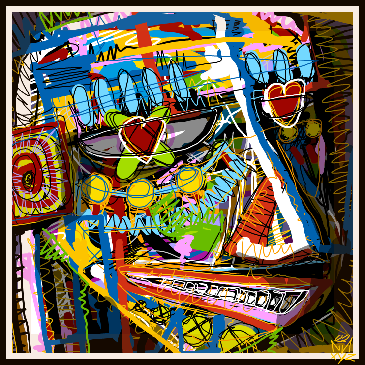
NNOTB #107
nnxyz
View & watch drawingHeart-shaped lenses, a concentric-ring target, coil lines, rectangular color blocks, and a row of marks at the mouth all compete across the same layer, making the face feel assembled from colliding parts.
Where the previous work splits text and face into distinct zones, here every element crowds the frame at once — motifs, marks, and structural lines refuse any hierarchy.
One more look
Choose a readable sign and look at its shape alone. What connects its lines or framing to the surrounding drawing?